Designing
something that adds a little more clarity or a few more features
to a design that has gone before - incremental design, is one
way of approaching a design task. This approach is often
more readily accepted and is generally much 'safer' in that less
risk of failure is involved. Producing a design that involves
a totally different and fresh approach clearly has the likelihood
of much greater opposition ~ this certainly proved the case
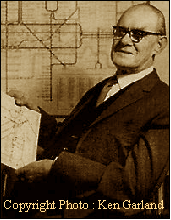
when Harry Beck chose to submit a new idea for a 'simpler' map
of the London Underground system in 1931. In projects of
your own you quite deliberately research some of the designs that
have gone before and by doing that it is often easier to judge
what has been successful and what clearly needs changing.
The
'Need'
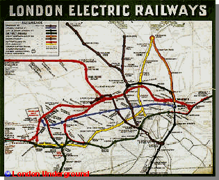
The
London Underground Map is exactly what you would most want it
to be. It is a map simply showing how the different Underground
rail-lines link up with other underground-lines. If you
have ever been to London you will appreciate how comforting it
can be to be to plan a journey using a simple map and then to
actually find the map helps you to achieve that. Providing
you are on the right 'coloured' line and are heading in the right
(there are after all only two) direction on any given line, seeing
the expected names of the stations appear as the train enters
the station calms you into feeling a part of the city - without
needing to know of the complexities of the street and buildings
above. The use we have for the map now is much the same
as when it was created except that Beck's design included only
8 lines whereas now there are 14 ~ clearly we have a more
complicated network to navigate than in the 1930's. It is
of course much the same in many other large and sprawling cities
with their own 'underground systems' but this map was the first
to take a sideways step at the task of laying out a simple map
unrelated to the topography that lay above it - a step that has
been copied by rail-lines, airlines and shipping lines across
the world. A visit to any of the websites belonging to the
major airlines may reveal maps with a very similar structure to
that of the underground network. ( BAA and KLM )
As
the tube system grew during the early 1900's maps showed
the layout as it related to communities and streets that lay above
it. This would be a perfectly predictable and acceptable
'design answer' in the early days of the system since the early
users would need to relate the comparatively new system to the
streets and areas they already knew. These early maps were
not Beck's and as the tube layout became more complex he
realised that a major simplification was necessary. The use of
lines drawn only in multiples of 45 degree angles allowed him
to begin his simplification.
His
task covered more than 30 years of development and in a time when
cartographic changes were not achieved by 'dragging and dropping'
or simply 'clicking a button' on
the
computer, this represented an astonishing degree of dedication.
His early maps and lettering were all drawn by